Refreshing the Hackathon Application Experience
Creating a unique design experience for students to apply to Canada's 2nd largest hackathon
Period:
Sept 2024 - Jan 2025
Role:
Product Designer, Illustrator
Team:
1 Designer, 3 Developers
Tools:
Figma, Adobe Illustrator, Angluar, MongoDB, Express, Node.js, Huroku

Context
What is uOttaHack?
uOttaHack is a student run hackathon that allows students of all backgrounds and experience to turn their ideas into a reality.
In order for the event to run, students have to apply to get in. uOttaHack has been trying to make their hacker application more interesting and not just a form. For 2024, I was tasked to work as the illustrator and designer to bring make the hacker experience more interesting.
Result
Within a couple months, I researched, designed, and interviewed an interactive application portal. This was released and over 2700+ students from across Canada would use the portal to apply to Ottawa’s largest hackathon.

Primary User
The primary user of this project, the applicant are high school, undergrad, and master’s students in tech/interested in that field. To see a broader spectrum of the applicant profile we focused on the primary feedback from the previous iterations of the hackathon and also from our point-of views as current students.
Research & Development
01 — Brainstorm
After 6 annual hackathons, there has been various editions of the application portal. While they got the job done, there was various feedback in terms of feeling very repetitive and non-memorable. The challenge: How to make an interactive and memorable way to apply to a hackathon?
02 — Research
After uOttaHack 6 - the 2024 edition of the hackathon, our team sent out surveys to conduct research of how our hackathon can improve from start to end. From that survey we received 326 responses from various students (undergraduate, graduate, PHD, high school...etc). The most common feedback received was receiving confirmation of their submissions, process of their applications, and a more interactive experience.

User’s Characteristics
“Within the process, there were three key characteristics that were vital.”
First, students are busy- they are multitaskers and tend to have heavy schedules. A lot of students don’t have the time nor the interest to fill and complete a lengthy application. Since our main demographic is engineering and computer science there is a scarcity of time for students within these programs.
Second, students who apply are typically interested in the creative aspect of growing and discovering within the tech space, They want to collaborate, and have the end-goal of creating by participating in the event.
Finally, students are interested in engaging. This application was designed with the idea of branching out of the typical resume format. Students apply to tens to hundreds of various applications. Thus, allowing people to remain engaged and bringing a sense of interest to the student’s workday was vital.

Objectives Translated
Utilizing the need from the characteristics, it's valuable due to helping us define objectives of how we can design for user success
Quick and Easy-to-fill - Applications should be quick and easily accessible by all applicants. It should take an appropriate amount of time to complete.
Informed - Applicants should be able to make decisions quickly and also recover from errors swiftly
Engagement - Applicants shouldn't be leaving any negative emotions while filling out their application process. Since many applicants leave their applications to the last minute or even wait till the extended applications release- providing a feeling of dread. This should create an environment that is fun so user's make it feel like it was a fun activity opposed than an application and think of the process as a larger priority.
Application
There were 4 fundamental sections to the application. Each part has its functions for various reasons. Below, I’ve elaborated each section and its relations with our project objectives.

Step 1 -Account Creation
The applicant has to create an account through uOttaHack before they proceed. This allows them to save all their information/work, allowing them to move forward to be able to store general and personal data. This is a vital part of the application since it allows the applicant to save their progress and come back to it later. This is also where the user can select their character.

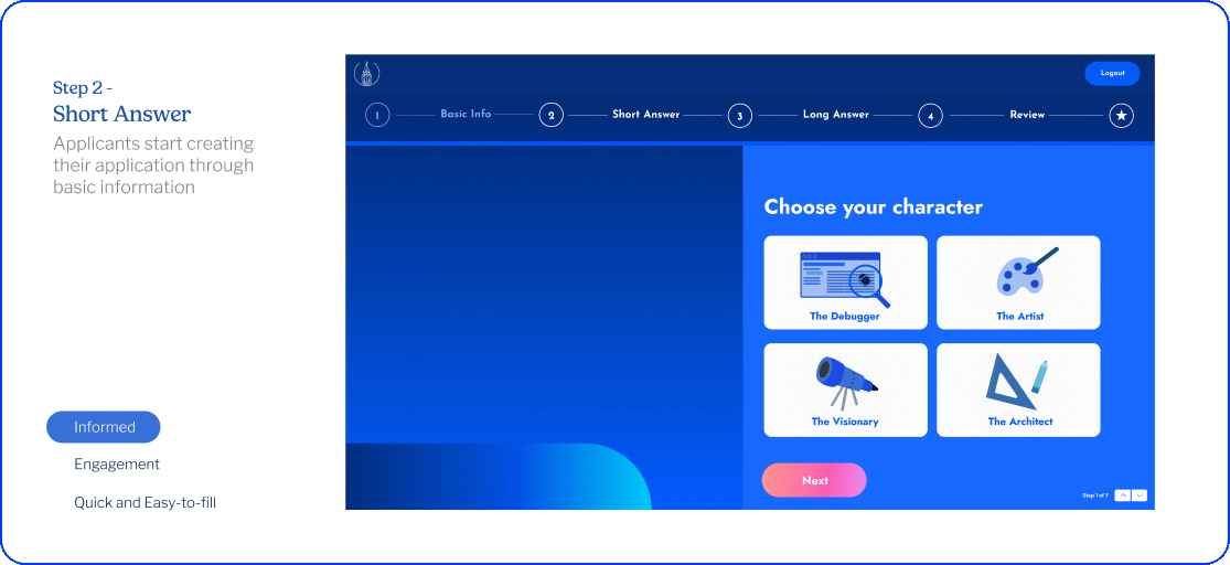
Step 2 -Short Answer
Applicants then proceeds by answering short questions which include their full name, level of study, pronouns, program, school, and more. As the fields are filled, the left of the page is updated to tailor to fit their unique profiles. In short, the users could just fill out their regular application; however, this inclusion of graphics and selection allows the experience to be unique, fun, and cute.
Step 3 -Long Answer
The most vital part of the application lies in the long answer portion. We created it so it benefits the user through easy-to-fill since it’s where most students will focus the majority of their time in this portion. The user can see the word count and the max word count they can use.
Within this section, there is not a usage of visual illustration since it may distract an applicant from their application. The focus was mainly on the word count requirements as well as different input states. This was to ensure that the user doesn’t feel overwhelmed by the application.

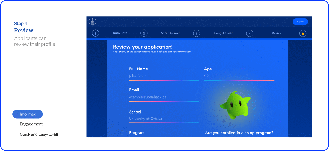
Step 4 -Review
The final step of the application is the review page. This is where the applicant can review their application and make any changes if needed. The applicant can also see the word count for each section and the total word count for the application.
This is also where the applicant can see their character and the character’s description. This is a fun way to end the application and makes the user feel accomplished.
Confirmation
And that's all! The confirmation step of the application is the confirmation page. Once the application is submitted the applicant can see a confirmation message. This is where the student can view their status and recieve a conformation email.

Reflection
The design of the application was just one portion of the project. The development team had to work on the backend and frontend of the application. The application was built using Angular, MongoDB, Express, and Node.js. The application was deployed on Heroku. The application was built to be responsive and accessible to all users.
After countless nights alone designing, studying student interests, and diving into discord messages, my app was finally ready. Through design reviews, dev reviews, and last minute syncs, I poured myself into every prototype and design iteration. The feedback I got made all those solitary hours of scrutiny worth it. Oftentimes I get so sucked into the details of my work that I forget the impact it can have on the people I'm designing for. This project brought to light how important it is to design for passion, not just perfection. It's moments like these that remind me why I continue to do what I'm doing.
Next Steps...
The application was released in December 2024 and over 2700+ students applied to uOttaHack. The feedback was positive and the application was a success. The next steps would be to continue to improve the application and make it more accessible to all students. The next steps are incorporating more accessibility features and making the application app more interactive and connected to other services our team offers such as profile cards, raffles, queues for food, and more in-person event involvements.
Try it out yourself!
View Style Guide
Illustrated by Lauren Hong
